THREE ZINES, 2009
1/ Gracia Haby
A vagary of impediments & a sneak of weasels
May, 2009
Digital print zine
Edition of 60
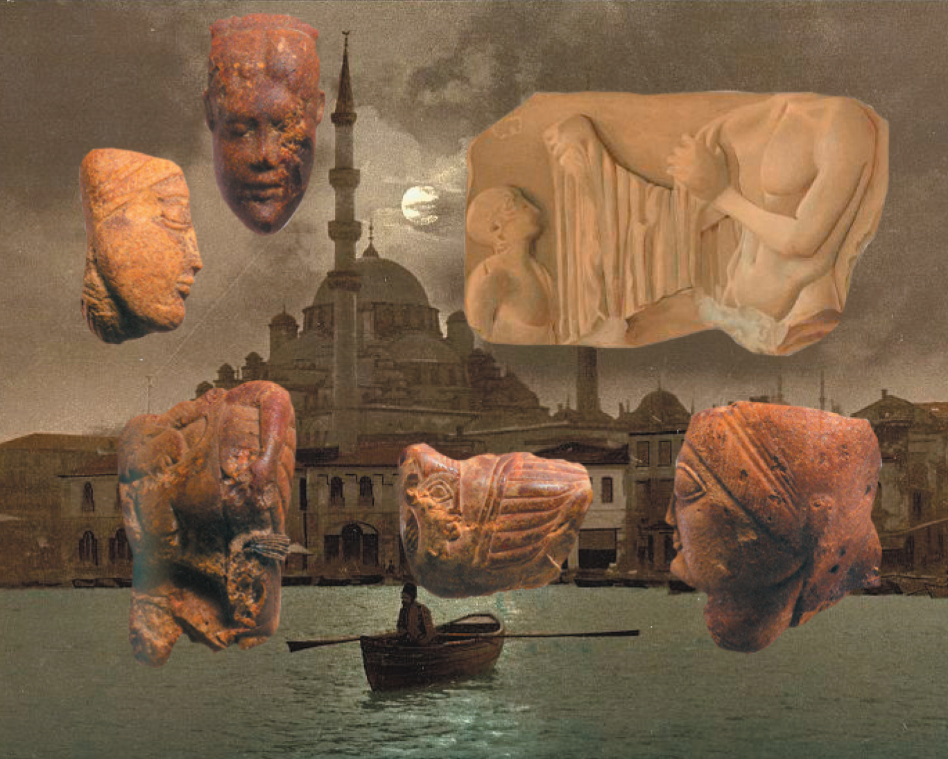
A 10.5cm X 15cm, 52 page colour and B&W zine with a pale-lilac cover and light-grey card spine, with a cardboard backing. Featuring 24 original collages (in both colour and B&W) and listing 140 collective nouns, this zine includes visual responses to a diligence of messengers, a catch of fish, an embarrassment of riches, a ticktock of clocks, a prickle of hedgehogs, a muster of soldiers, a volery of birds, a spring of seals, a colony of fungi and, of course, a vagary of impediments and a sneak of weasels.
Inspiration drawn from the collective nouns and their exploration on A skulk of foxes & a husk of hares (2008–2012), a blog responding to collective nouns.
This zine was included in the box set, ...and then there were none (edition of three artists’ proofs, compiled 2011), made especially for the IMPACT7 2011 zine fair co-ordinated by Anna Poletti at MUMA. The three sets of artists’ proofs were of a loose trio of zines that won the 2010 Artspace Mackay Inaugural Zine Prize, as part of the 2010 Libris Awards.
...and then there were none included:
Tumble & Fall (2009)
A vagary of impediments & a sneak of weasels (2009)
Postcards from... But for the moon nobody could see us (2008)
﹏
RELATED LINK,
ARTSPACE MACKAY
RELATED POSTS (OR 'A ZINE TAKES SHAPE SLOWLY'),
ADDING SALT TO THE WEEK WITH A THUMP
A CHINE OF POLECATS CARRYING FOUR NEW ZINES
DELICATE
A SPRING OF SEALS AND OTHER DETAILS
ANIMALISED
2/ Louise Jennison
Tweak, tweaked, tweet
May, 2009
Digital print zine
Edition of 100
A 10cm X 42cm, six page concertina B&W zine with a string tie. Featuring in neat formation a Grey Currawong, Pictorella Mannikin, Yellow-rumped Mannikin, Tristram’s Storm-petrel, Willie Wagtail, Black-faced Cuckoo-strike, Grey Butcherbird, Slender-billed White-eye, Brown Cuckoo-dove and a Sacred Kingfisher.
(For the bird enthusiast: all birds drawn are from Australia)
This zine was exhibited as part of CFPR Book Arts: New Wave: artists’ publishing in the 21st Century, School of Creative arts, University of West England, Bristol, UK, 15th – 19th of September, 2009. The exhibition formed part of a two-year research project which aimed to extend and sustain critical debate of what constitutes an artist’s book in the 21st Century in order to propose an inclusive structure for the academic study, artistic practice and historical appreciation of the artist’s book.
Tweak, tweaked, tweet was also exhibited as part of Space Invaders at the National Gallery of Australia in 2011. The exhibition toured to UQ Art Museum, University of Queensland, Brisbane (2011), RMIT Gallery, RMIT University, Melbourne (2011), and Western Plains Cultural Centre, Dubbo, NSW (2011–2012).
Tweak, tweaked, tweet was later exhibited as part of Prima Facie, an exhibition hosted by Bower Ashton Library, University of West England, Bristol, UK, 8th of July – 31st of August, 2021, curated by Amir Brito Cadôr.

CFPR Book Arts: New Wave: artists’ publishing in the 21st Century, School of Creative arts, University of West England
●
Space Invaders
Drawn entirely from the collection of the National Gallery of Australia, the first Australian institution to have collected this type of work, Space invaders surveys the past 10 years of Australian street art. Featuring 150 works by over 40 Australian artists, this exhibition celebrates the energy of street-based creativity and recognises street stencils, posters, paste-ups, zines and stickers as comprising a recent chapter in the development of Australian prints and drawings.
Space invaders looks at artists and their iconic street-based works at the point of their transition from the ephemeral to the collectable and from the street to the gallery.
National Gallery of Australia
Prima Facie
This exhibition was made using as criterion for selection; the books’ covers and the first impression caused by them, as indicated in the Italian expression taken as title for this show, prima facie which translates as “at first sight”. It’s part of an ongoing investigation about the main characteristics of artists’ books covers and presents a typology, its uses and functions (mute, ironic or enigmatic covers).
There are 16 pieces of information that can appear on the cover of an ordinary book, but all possibilities were never explored at the same time. The only practically mandatory mentions are the author’s name, title of the work and the publisher. In the case of artists’ books, which are mostly self-published, the latter information does not usually appear on the cover, a practice that was maintained even when they were published by a major commercial publisher (maybe because the book is also a work of art and the cover is an integral part of the art object). Usually, only the author’s name and title remained as information. Perhaps for the sake of modesty, the author’s name does not always appear on the cover (in some cases, it is necessary to look for it elsewhere in the book). Unlike literary works, in which the more famous the author is, the greater their name on the cover, in artists’ books the absence of this information on the cover may indicate that the work is more important than the author. Thus, the title has become the predominant element on the covers of many artists’ books.
The typographic cover is the most common type among artists’ books maybe because it does not reveal the contents of the book. Another reason for this predominance of typographic covers is that the title of the work plays an important role in some books, so they are presented with great care. Some examples with text display fonts and some book covers made with handwritten texts were selected Special attention was given to the image and text relationship, sometimes the text is presented as image and sometimes it is inside an image. Some of them mimic commercial book covers and some of them make a parody of an entire genre. Interestingly, there are many artists’ books that are self-referring, or metalinguistic, but there are not many artists’ books with the image of a book on the cover. We can find examples of unique covers within the print run and covers that change with each new edition and other types of cover variations for the same book. Anything could be used as theme for an artist’s book, even book covers. As the author of the book and the author of the cover is usually the same person, some books have a narrative that begins on the cover, a demonstration that every aspect of the book counts for the evaluation of the artist’s book.
Selected books for the exhibition from the ABPP archive:
10 significant train journeys, Imi Maufe, 2004
A 4 Hour Walk on Every Road in the Southville Residents’ Parking Scheme, Tom Sowden, 2016
AGREE TO DISAGREE, Guy Bigland, 2020
Another picture of me as Dracula, Ludovic Burel, 2007
Closure, Sarah Bodman, 2009
Cover Version, Jonathan Monk, Book Works, 2004
Decimals of feelings, seekers of lice, 2008
Fresh Fruit and Tables, David Bellingham, The Changing Room, 2008
Grab The Uranium, Craig Atkinson, Art Prison No.3, Knust Work Holidays Series, 2011
How to sharpen pencils, David Rees, 2012
Light Bound: A Love Affair Between Books and Light, Sara Ranchouse Publishing, 2004
Make, Katherine Johnson, 2008
MIM, Helen Douglas and Telfer Stokes, Weproductions, 1986
New Machines Coming Soon, Chris Lloyd, kitbooks, 2017
Paragraph, Colin Sackett, 1998
Pink Paper, Mark Pawson, 2004
Songs of Birds Wearing Safety Gear, Bill Burns, Plug in Editions, 2000
The book as the future of the past, Franziska Brandt & Moritz Grünke, Gloria Glitzer, 2015
Tweak, tweaked, tweet, Louise Jennison, 2009
The Theatre of Nature: or Curiosity Filled the Cabinet, Angela Lorenz, 2002
Typewriter Manual Volume 2, Sara Mackillop, 2013
Unprocessed, Roelof Bakker, 2020
Utopia by Thomas Moore, Jeremy Deller & Fraser Muggeridge studio, Somerset House, 2016
We Are Small, Elisabeth Tonnard, 2012
We go to the gallery, Dung Beetle Reading Scheme, M Elia & E Elia, 2015
Where in the world?, Hazel Grainger, 2012
White Heat, Stephen Fowler, 2010
Who I am and What I Want, David Shrigley, Redstone Press, 2006
Why Publish Noise?, Miekal And, so-Viele.de 66, 2020
WOW BOW WOW WOW, Jeremy Dixon, Hazard Press, 2014
Amir Brito Cadôr
Escola de Belas Artes, Federal University of Minas Gerais, Belo Horizonte, Brazil
Coleção Livro de Artista
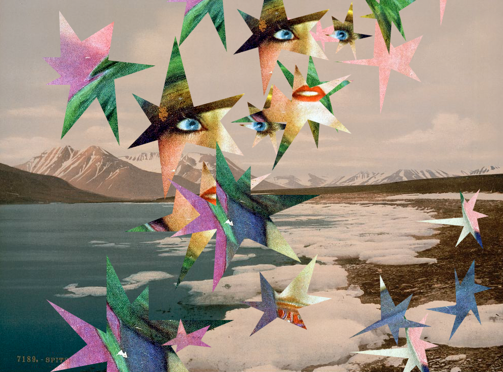
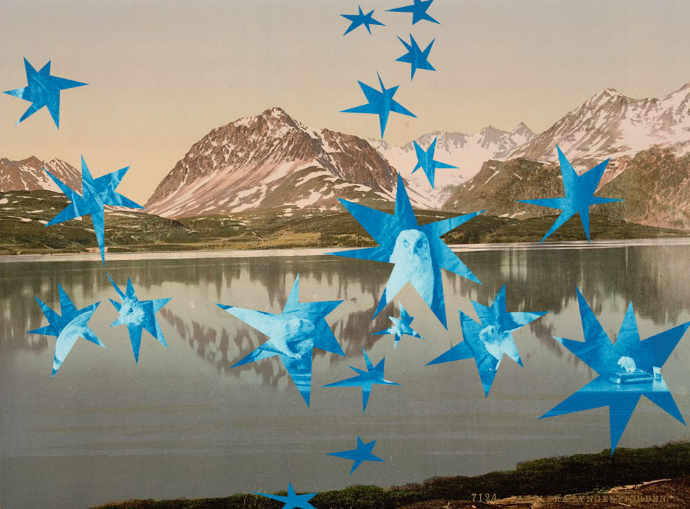
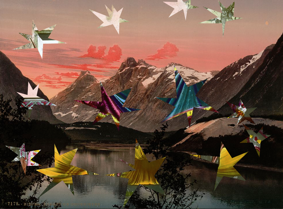
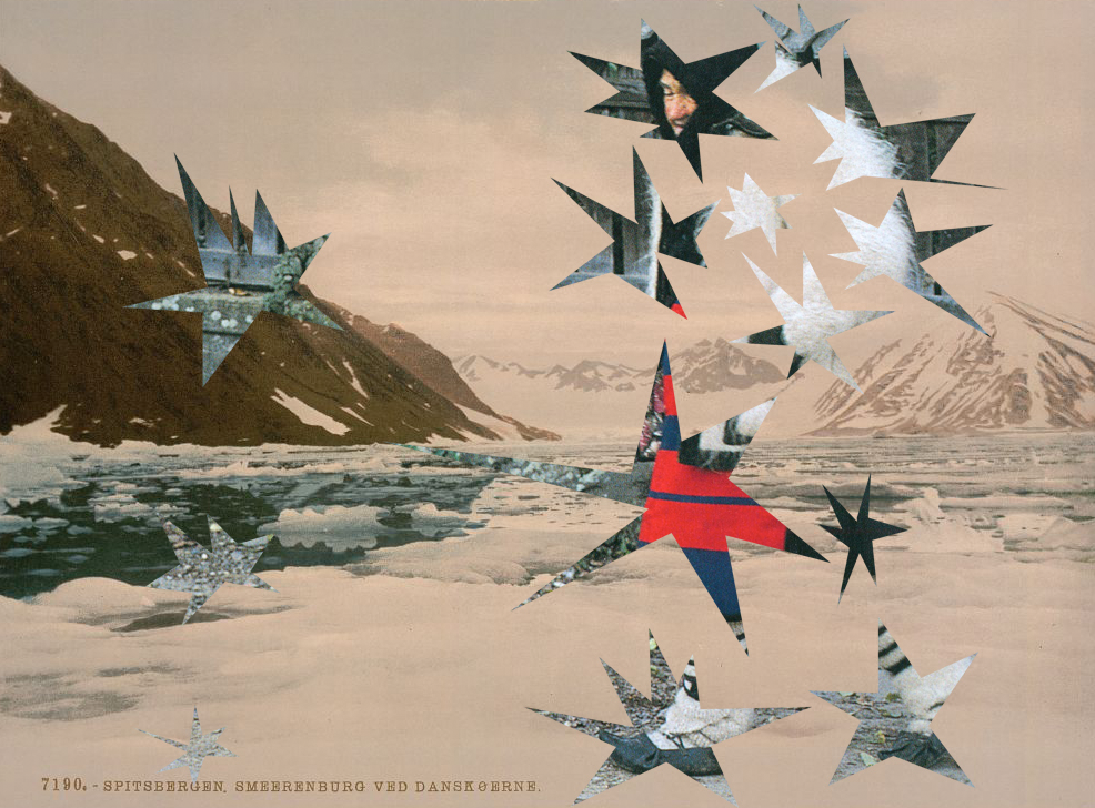
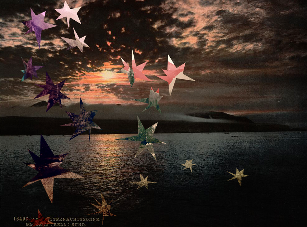
3/ Gracia Haby
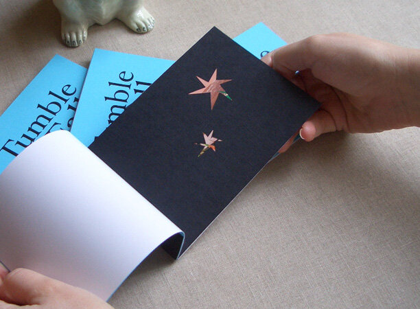
Tumble & Fall
May, 2009
Digital print zine
Edition of 60
A 10.5cm X 15cm, 17 page colour zine with a peacock-blue cover card and black card spine, with a cardboard backing. Includes four black linen-paper pages with hand-cut smattering of stars. Featuring Tumble and Fall collages I through XII.
This zine was included in the box set, ...and then there were none (edition of three artists’ proofs, compiled 2011), made especially for the IMPACT7 2011 zine fair co-ordinated by Anna Poletti at MUMA. The three sets of artists' proofs were of a loose trio of zines that won the 2010 Artspace Mackay Inaugural Zine Prize, as part of the 2010 Libris Awards.
Remote and incandescent, stars hang in the night sky, luminous and fixed, held by their own gravity. Billions of years old, you can look upon them for a little celestial navigation and orientation, and you can even make a wish upon one.
(From inside the front cover of the zine)